Spacing
Spacing defines the relationship between elements and makes the content more easily scannable.

Values and examples
The spacing scale uses multiples of 4px and offers a wide range of values. It was designed to be easily applied and to be able to distance both large and small elements.
During handoff, it's not necessary to specify spacing inside Admin UI components. To specify spacing elsewhere, use the utilities in the Admin UI – File Organization Figma library or the Measure Figma plugin.
Containers
| Container type | Padding | Examples |
|---|---|---|
| Wide | Horizontal padding much larger than vertical padding. | Tag Page Header |
| Narrow | Vertical padding much larger than horizontal padding. | Tabs |
| Even | The same value for vertical and horizontal paddings. | Card Modal |
| Optical | Horizontal padding is slightly larger than vertical padding to account for the visual weight of the container. | Alert Toast |
Actions
| Action size | Height | Examples |
|---|---|---|
| Small | Up to 28px height. | Selected option in a Combobox |
| Medium | Between 28px and 44px height. | Normal Button Normal Menu Filter Select Inline |
| Large | More than 44px height. | Large Button Large Menu Tab |
Tokens
| Token | px | rem | Examples |
|---|---|---|---|
$space-0 | 0 | 0 | Vertical space between: • $body Texts• $detail Texts (Input Field, Control Field) |
$space-05 | 2 | 0.125 | Vertical space between: • $body Text → $detail Text (Control Field label and help text)• Label → $body Text (Table cell with a 2 lines) |
$space-1 | 4 | 0.25 | Vertical space between: • $title2 Text → $body Text (Filter and Combobox empty states)• Label → Input (Input Fields) • Input → $detailText (Input Fields help or error texts) |
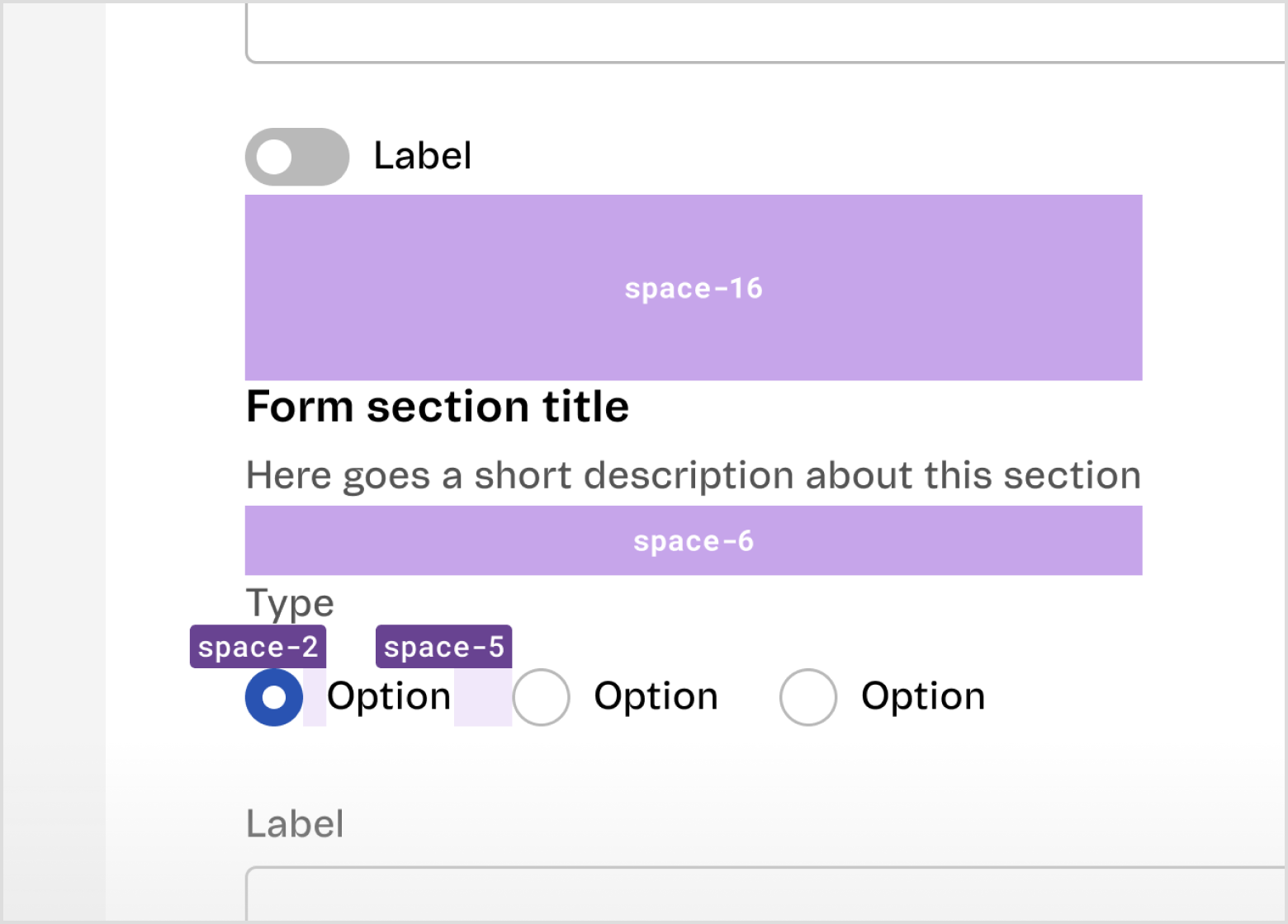
$space-2 | 8 | 0.5 | Vertical space between: • Trigger → Overlay (Date Picker, Combobox, Filter, Select Inline, Menu) • Label → Tag Normal Horizontal space between: • Control → $body Text (Checkbox, Radio)• Trigger → Overlay (Filter, Select Inline, Menu, Combobox, Date Picker) • Icon → Short text (Search, Combobox) • Medium Actions with a background (FilterBar) • Large Actions without a background (Tabs) • Short text → Normal Action without background (Toast, Pagination) |
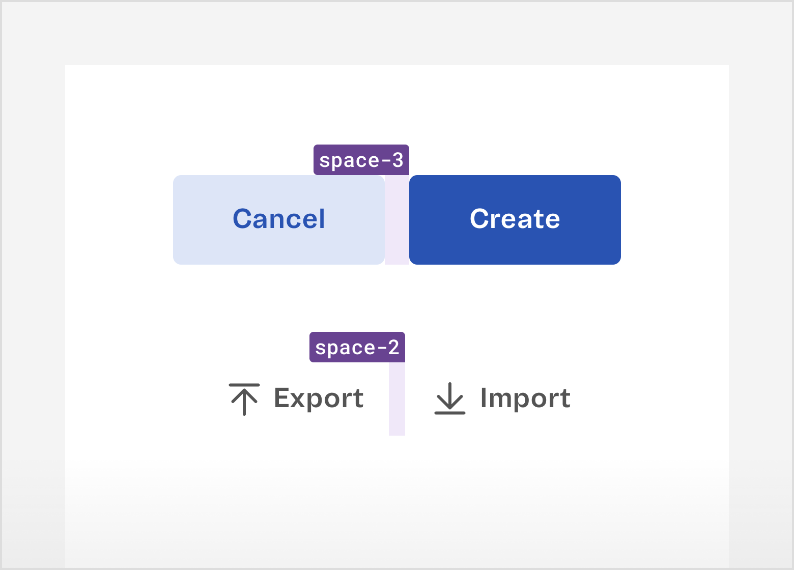
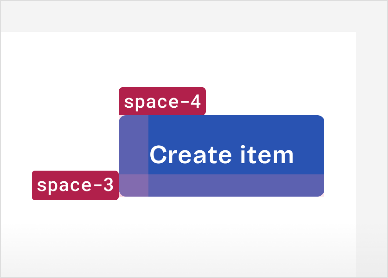
$space-3 | 12 | 0.75 | Vertical space between: • Control Fields → $detail Text (Checkbox or Radio Group help text)Horizontal space between: • $body Text → Control Fields (Checkbox Group, Radio Group)• Icon → Long Text (Toast, Alert) • $pageTitle → Tag Large (Page Header)• $title1 → Tag Normal (Card, Modal)• $body Text → Tertiary Button (Toast, Alert)• Small wide container, left and right paddings (Tag) |
$space-4 | 16 | 1 | Vertical space between: • Control Fields • Input Fields • Cards • Toolbars Horizontal space between: • Input fields • Cards |
$space-5 | 20 | 1.25 | Horizontal space between: • Control fields • Toolbars (Data View Pagination and Actions) Horizontal space: • Medium optical container (Alert and Toast padding-left and right) |
$space-6 | 24 | 1.5 | Vertical space between: • Section Header → Section Content (Search and Table in DataView) • Section Content → Section Footer (Table and Pagination in Data View) Vertical space: • Large wide containers (Card Header and Footer, Modal Header and Footer top and bottom paddings) |
$space-7 | 28 | 1.75 | Vertical space: • Large optical containers (Card and Modal top and bottom paddings) |
$space-8 | 32 | 2 | Vertical and Horizontal space: • Large even containers (Card and Modal paddings) Horizontal space: • Large wide containers (Card Header and Footer, Modal Header and Footer left and right paddings) • Large optical containers (Card and Modal left and right paddings) |
$space-10 | 40 | 2.5 | Vertical space: • Standard Pages margin-top • Vertical and Horizontal space: • Toast bottom and right margins |
$space-12 | 48 | 3 | Vertical space: • Wide Pages margin-bottom • Narrow Pages margin-top |
$space-16 | 64 | 4 | Vertical space between: • Form sections |
$space-20 | 80 | 5 | Vertical space: • Standard pages margin-bottom |
$space-24 | 96 | 6 | |
$space-28 | 112 | 7 | |
$space-32 | 128 | 8 | Vertical space: • Narrow pages margin-bottom |
Principles
The choice of which spacing value to use should be intentional, just like every other aspect of the user interface. Consider the following principles when designing with spacing:
Relationships and hierarchy
Humans instinctively look for patterns, so it is important to keep the Gestalt principles in mind, such as similarity, proximity, continuity, closure and common region.
- Elements that are meaningfully related should be closer to each other, for example, a Checkbox and its label.
- Elements arranged in the same spacing pattern are usually perceived as having similar weight, for example, options in a Checkbox Group.
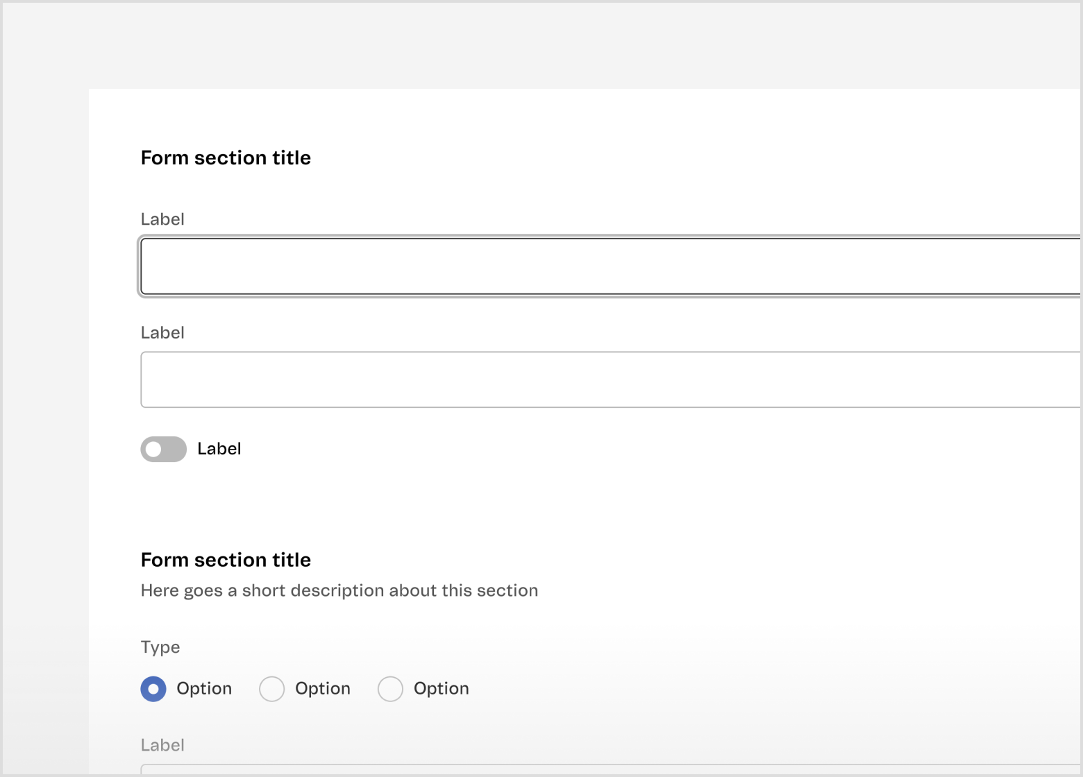
- Spacing can also define the relationships between groups of elements. For example, the space between form sections should have a higher value than the space between the form section title and a field.
- Elements with more spacing around them are usually perceived as having a higher relevance on the interface, for example, the spacing around an error state of a DataView.
Visual rhythm
The visual rhythm of an interface is defined by pattern repetition. Spacing is a valuable resource to create rhythm in a design, improving predictability, scannability and hierarchy. It also allows you to draw the user’s attention to specific points by intentionally breaking the pattern.
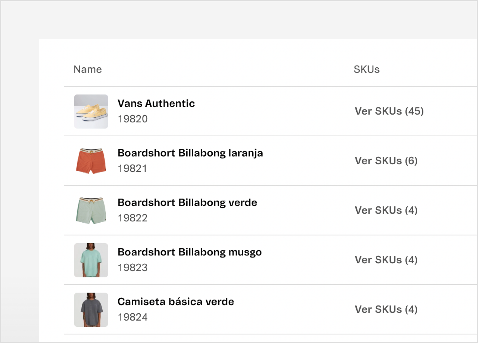
- The rhythm can be more predictable when elements within a screen have the same level of importance, such as in a Table.
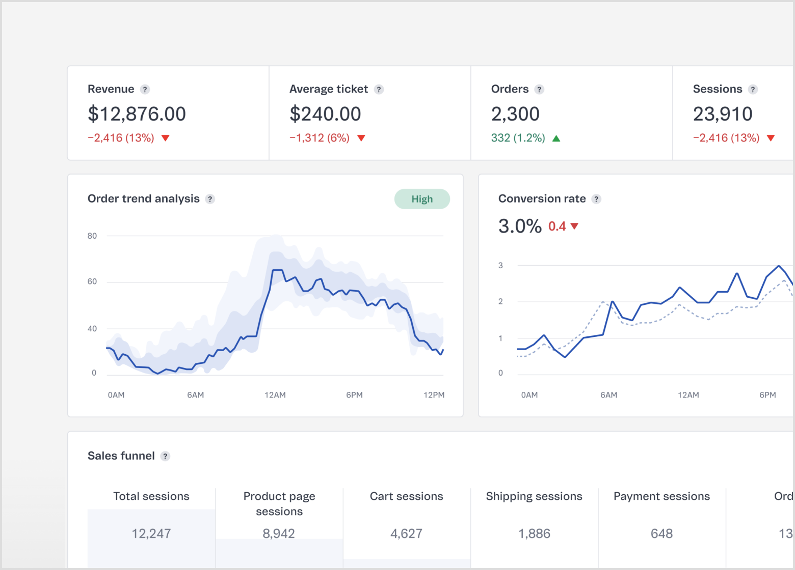
- The rhythm can also help organize elements that may have different levels of importance, such as in a Dashboard.
Consistent density within the Admin
Blank spaces are used up to the point that makes it easier to consume information, since the Admin is a tool for work. The density adopted in an interface needs to follow the Admin pattern.
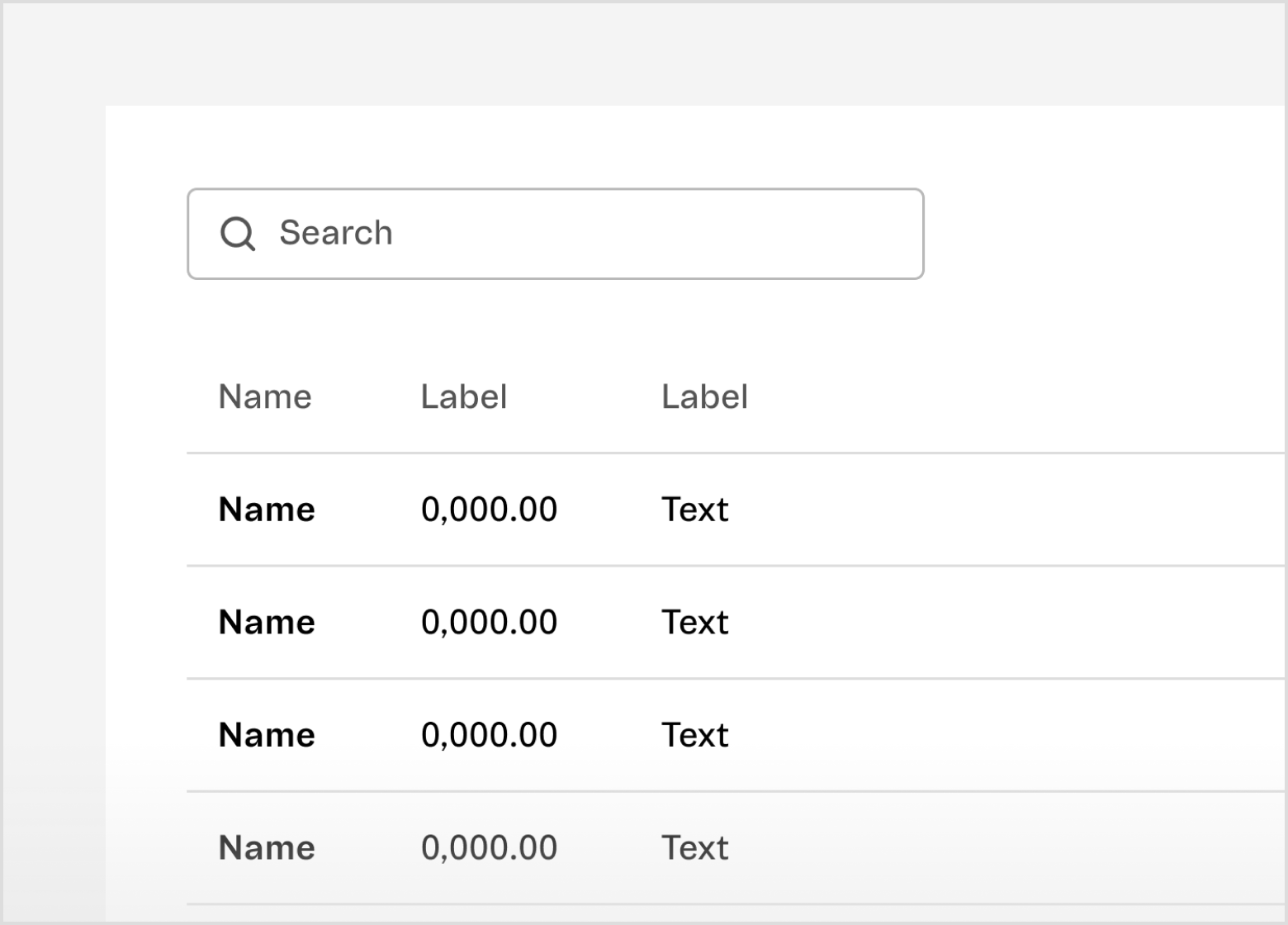
- Tighter spacing – more dense – increases the level of scannability for large sets of data, such as in a Table.
- Looser spacing – less dense – increases the level of hierarchy or helps define groups within an interface, such as Form sections.
Visual weight
The spacing scale can be applied horizontally or vertically. Depending on the visual weight of the element, sometimes using the same value on both axes doesn't result in a balanced composition. In these scenarios, it's necessary to optically adjust the spacing.
Observe if the components have a well-defined background (filled or with stroke) or not. For example, the spacing value between primary and secondary Buttons should be larger than the spacing value between two tertiary Buttons.