
Core
Theme
Below you can check the new updates, but you should also check the documentation to understand the improvements.
- Using the Admin UI theme just got easier. The
createSystemfunction is not needed anymore, just import theThemeProviderdirectly. - The way of styling a native JSX element was also simplified. Now, it is possible to import directly from
admin-uia function calledcsxto create a className with the styles. Thecsxfunction only uses the default theme under the hood. - The
ThemeProviderprovides a new prop calledexperimentalThemefor those cases when you need to override the default theme and meet some specific design requirements. TheexperimentalThemeprop will receive the new theme object. - The
ThemeProviderprovides a new boolean prop calledexperimentalDisabledGlobalStylesto disable all the default global styles and enable the use of your own global styles. - The
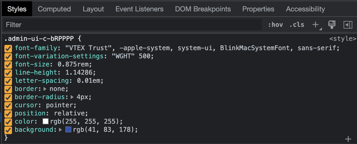
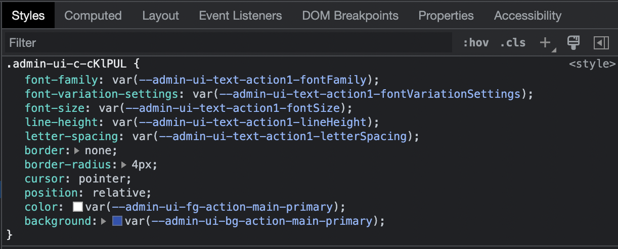
colorsandtypographytheme tokens are now parsed to CSS variables.
ThemeProvider
Before
import { createSystem } from '@vtex/admin-ui'

const [ThemeProvider] = createSystem()

function Root() {
  return {
    <ThemeProvider>
      {/* your app ... */}
    </ThemeProvider>
  }
}
After
import { ThemeProvider } from '@vtex/admin-ui'

function Root() {
  return {
    <ThemeProvider>
      {/* your app ... */}
    </ThemeProvider>
  }
}
csx function
// import the csx function
import { csx } from '@vtex/admin-ui'
function Example() {
  return (
    <nav
      className={csx({
        bg: '$primary',
        'button + button': {
          marginLeft: '$s',
        },
      })}
    />
  )
}
Overriding
1. Theme:
function RootComponent() {
const customTheme = {
colors: {
// all colors styles
},
fonts: {
// all font styles
},
// other theme props...
};
// Use at the root of your app
return (
<ThemeProvider experimentalTheme={customTheme}>
{/** your app code here */}
</ThemeProvider>
);
}
2. Global:
function RootComponent() {
  // Use at the root of your app
  return (
    <ThemeProvider experimentalDisabledGlobalStyles>
      {/** your app code here */}
    </ThemeProvider>
  )
}
Tokens as CSS variables
Button inspect then
Button inspect now
Deprecated tag.[el]
To reduce the library footprint, and enhance cohesion, the tag factory is deprecated. You should use Box instead. We have a codemod to help you with this migration:
npx admin-ui-codemod tag-to-box
Before
<tag.div
  csx={
    {
      // your styles
    }
  }
/>
After
<Box
  as="div"
  csx={
    {
      // your styles
    }
  }
/>
fg alias
The csx accepts fg as an alias for color:
<Box
  csx={{
    fg: '$primary',
  }}
/>
Is shorthand for:
<Box
  csx={{
    color: '$primary',
  }}
/>
colorTheme util
The csx accepts colorTheme as a utility to apply color and background values of the same palette.
<Box
  csx={{
    colorTheme: 'blue',
  }}
/>
is shorthand for:
<Box
  csx={{
    color: '$blue10',
    backgroundColor: '$blue60',
  }}
/>
negative util
Negative values and tokens are threatened as edge cases by the csx. You need the negative function for this kind of transformation.
import { negative } from '@vtex/admin-ui'

function Example() {
  return (
    <Box
      csx={{
        marginLeft: '-1rem', // custom values work normally
        marginRight: negative('$s'),
      }}
    />
  )
}
Colors as tokens
The bg and fg accepts colors from the palette as tokens.
Before
import { color } from '@vtex/admin-ui'

function Example() {
  return (
    <Box
      csx={{
        bg: color('blue60'),
      }}
    />
  )
}
After
<Box
  csx={{
    bg: '$blue60',
  }}
/>
Responsive Property
Now in the layout components, you can use something similar to the responsive aliases within the component props. We call it Responsive Property. This is a replacement for the deprecated Responsive Arrays.
<Stack
  space={{ mobile: '$l', desktop: '$2xl' }}
  fluid={{ mobile: true, tablet: false }}
  direction={{ mobile: 'column', tablet: 'row' }}
>
  {...}
</Stack>
Components
Table
Below you can check the new updates, but you should also check the documentation to look for new features.
New Features
- It is possible to set columns to be fixed when scrolling horizontally. You just need to set the column prop
fixedtotrue. - New resolver called
menuto easily render a column with aMenucomponent and a set of actions. - New resolver called
bulkto add a bulk actions to the table. It is an easier way of using the newBulkActionscomponent within the Table.
1. Fixed columns
const state = useTableState({
  columns: [
    {
      id: 'id',
      fixed: true, // 1st fixed column
      resolver: {
        type: 'selection',
        mapId: (item) => item.id,
      },
    },
    {
      id: 'name',
      header: 'Name',
      fixed: true, // 2nd fixed column
      resolver: {
        type: 'text',
        columnType: 'name',
        mapText: (item) => item.name,
      },
    },
    // Other table columns...
  ],
})
2. Menu resolver
const state = useTableState({
  columns: [
    // Other table columns...
    {
      id: 'menu',
      resolver: {
        type: 'menu',
        actions: [
          {
            label: 'Edit',
            icon: <IconPencil />,
            onClick: (item) => {
              console.log(item)
            },
          },
          {
            label: 'Delete',
            icon: <IconTrash />,
            onClick: (item) => {
              setItems(items.filter((i) => i.id !== item.id))
            },
          },
        ],
      },
    },
    // Other table columns...
  ],
})
3. Bulk resolver
const pagination = usePaginationState({
  pageSize: 100,
  total: 5,
})

const bulk = useBulkActions({
  totalItems: pagination.total,
  pageItems: items,
  pageSize: pagination.pageSize,
})

const table = useTableState({
  view,
  columns: [
    {
      id: 'id',
      resolver: {
        type: 'bulk',
        state: bulk,
      },
    },
    {
      id: 'name',
      header: 'Product Name',
    },
    // Other table columns...
  ],
  items,
})
Bulk Actions
Now you can use the BulkActions component to perform actions in a set of items. You can use it standalone or within the table. Check the documentation
Filters
Below you can check the new updates and breaking changes, but you should also check the documentation to learn about new features and usage examples.
New Features
- Filter status (
loading,empty,not found,error), that can be set by the developer. - "Optional filters" feature, witch allows filters to be initially hidden and have the visibility controlled by the user.
- New optional
onClearcallback on useFilterGroup - Composable components API that enables custom features or behaviours.
Breaking Changes
Filter,FilterSearch,FilterMultipleandFilterSearchMultipleno longer exist, all of them can be implemented using the new composable filter components.
Filter
Before
function Filter() {
  const state = useFilterState({
    items: [
      { label: 'Available', id: '#1' },
      { label: 'Sold out', id: '#2' },
    ],
    onChange: () => {},
    label: 'Status',
  })
  return <Filter state={state} />
}
After
function Filter() {
  const filterState = useFilterState()

  return (
    <>
      <FilterDisclosure state={filterState}>Status</FilterDisclosure>

      <FilterPopover state={filterState}>
        <FilterListbox>
          <FilterOptionRadio id="#1" label="Available" />
          <FilterOptionRadio id="#2" label="Sold out" />
        </FilterListbox>
        <FilterFooter />
      </FilterPopover>
    </>
  )
}
FilterMultiple
Before
function FilterMultiple() {
  const state = useFilterMultipleState({
    items: [
      { label: 'Full', id: '#1' },
      { label: 'Empty', id: '#2' },
      { label: 'Half empty', id: '#3' },
    ],
    onChange: () => {},
    label: 'Status',
  })
  return <FilterMultiple state={state} />
}
After
function FilterMultiple() {
  const filterState = useFilterMultipleState()

  return (
    <>
      <FilterDisclosure state={filterState}>Status</FilterDisclosure>

      <FilterPopover state={filterState}>
        <FilterListbox>
          <FilterOptionCheckbox id="#1" label="Full" />
          <FilterOptionCheckbox id="#2" label="Empty" />
          <FilterOptionCheckbox id="#3" label="Half Empty" />
        </FilterListbox>
        <FilterFooter />
      </FilterPopover>
    </>
  )
}
FilterSearch
Before
function FilterSearch() {
  const state = useFilterState({
    items: [
      { label: 'Rio de Janeiro', id: '#1' },
      { label: 'New York', id: '#2' },
      { label: 'Paris', id: '#3' },
      { label: 'Tokyo', id: '#4' },
      { label: 'São Paulo', id: '#5' },
      { label: 'Berlin', id: '#7' },
      { label: 'Washington', id: '#8' },
      { label: 'Lisboa', id: '#9' },
      { label: 'Porto', id: '#10' },
      { label: 'João Pessoa', id: '#11' },
      { label: 'Salvador', id: '#12' },
      { label: 'Barcelona', id: '#13' },
    ],
    onChange: ({ selected }) => console.log(`applied: ${selected.label}`),
    label: 'City',
  })

  return <FilterSearch state={state} />
}
After
function FilterSearch() {
  const filterState = useFilterState({
    searchableList: [
      { label: 'Rio de Janeiro', id: '#1' },
      { label: 'New York', id: '#2' },
      { label: 'Paris', id: '#3' },
      { label: 'Tokyo', id: '#4' },
      { label: 'São Paulo', id: '#5' },
      { label: 'Berlin', id: '#7' },
      { label: 'Washington', id: '#8' },
      { label: 'Lisboa', id: '#9' },
      { label: 'Porto', id: '#10' },
      { label: 'João Pessoa', id: '#11' },
      { label: 'Salvador', id: '#12' },
      { label: 'Barcelona', id: '#13' },
    ],
  })

  return (
    <>
      <FilterDisclosure state={filterState}>Status</FilterDisclosure>

      <FilterPopover state={filterState}>
        <FilterSearchbox />
        <FilterListbox>
          {filterState.matches.map((item) => (
            <FilterOptionRadio {...item} />
          ))}
        </FilterListbox>
        <FilterFooter />
      </FilterPopover>
    </>
  )
}
FilterMultipleSearch
FilterSearch
Before
function FilterMultipleSearch() {
  const state = useFilterMultipleState({
    items: [
      { label: 'Rio de Janeiro', id: '#1' },
      { label: 'New York', id: '#2' },
      { label: 'Paris', id: '#3' },
      { label: 'Tokyo', id: '#4' },
      { label: 'São Paulo', id: '#5' },
      { label: 'Berlin', id: '#7' },
      { label: 'Washington', id: '#8' },
      { label: 'Lisboa', id: '#9' },
      { label: 'Porto', id: '#10' },
      { label: 'João Pessoa', id: '#11' },
      { label: 'Salvador', id: '#12' },
      { label: 'Barcelona', id: '#13' },
    ],
    onChange: ({ selected }) => console.log(`applied: ${selected.label}`),
    label: 'City',
  })

  return <FilterMultipleSearch state={state} />
}
After
function FilterMultipleSearch() {
  const filterState = useFilterMultipleState({
    searchableList: [
      { label: 'Rio de Janeiro', id: '#1' },
      { label: 'New York', id: '#2' },
      { label: 'Paris', id: '#3' },
      { label: 'Tokyo', id: '#4' },
      { label: 'São Paulo', id: '#5' },
      { label: 'Berlin', id: '#7' },
      { label: 'Washington', id: '#8' },
      { label: 'Lisboa', id: '#9' },
      { label: 'Porto', id: '#10' },
      { label: 'João Pessoa', id: '#11' },
      { label: 'Salvador', id: '#12' },
      { label: 'Barcelona', id: '#13' },
    ],
  })

  return (
    <>
      <FilterDisclosure state={filterState}>Status</FilterDisclosure>

      <FilterPopover state={filterState}>
        <FilterSearchbox />
        <FilterListbox>
          {filterState.matches.map((item) => (
            <FilterOptionChecbox {...item} />
          ))}
        </FilterListbox>
        <FilterFooter />
      </FilterPopover>
    </>
  )
}
Toast component review
New Features
- Now you can replace an active toast with another one. Only a single toast with a given id is visible at once and you can use it to reduce the number of toasts on your app. Check the documentation
Breaking Changes
- The
toneproperty has changed tovariant - Now all the toasts are dismissible by default, you should use the
dismissibleprop with the valuefalseto change it.
Before
const showToast = useToast()

showToast({
  tone: 'critical',
  message: 'Type a short message here',
  dismissible: true,
  action: {
    label: 'Action',
    onClick: () => // do something,
  },
})
After
const showToast = useToast()

showToast({
  variant: 'critical',
  message: 'Type a short message here',
  action: {
    label: 'Action',
    onClick: () => // do something,
  },
})
Card component review
Added CardHeader, CardInfo, CardTitle, CardActions, CardContent, and CardImage composites. You can use them to help you implement card layouts while reusing the definitions from the design team to the spacing and positioning of the elements.
Before
<Card>
  {...}
</Card>
After
// Basic example
<Card>
  {...}
</Card>

// Full example
<Card>
  <CardHeader>
    <CardInfo>
      <IconImageSquare />
      <CardTitle>Title</CardTitle>
      <Tag label="Short text" />
    </CardInfo>
    <CardActions>
      <Button variant="tertiary">Label</Button>
      <Button variant="secondary">Label</Button>
    </CardActions>
  </CardHeader>
  <CardContent>{...}</CardContent>
</Card>
Flex component review
Now all of the custom properties have the type ResponsiveProp
Grid component review
Now all of the custom properties have the type ResponsiveProp
Columns component review
New features
- Now all of the custom properties have the type ResponsiveProp
Breaking Changes
- The
spacingproperty has changed tospace. - You can’t use Responsive Arrays with the
unitsandoffsetproperties anymore, you must use ResponsiveProps instead.
Before
<Columns spacing={1}>
  <Column units={6} offset={['right', 'right', 'none']}>{...}</Column>
  <Column units={[3, 2, 1]}>{...}</Column>
</Columns>
After
<Columns space="1">
  <Column units={6} offset={{ mobile: 'right', desktop: 'none'}}>
    {...}
  </Column>
  <Column units={{ mobile: 3, tablet: 2, desktop: 1 }}>
    {...}
  </Column>
</Columns>
Set
This component was removed in this release. You must use Stack now. We have a codemod to help you in this migration.
npx admin-ui-codemod set-to-stack